

The original weave.
A practical guide to the Gameloom identity.
For the worlds we have yet to make together.
Brand system / 2026
A practical guide to the Gameloom identity.
For the worlds we have yet to make together.
How to use this guideBegin with the supplied artwork. Use these rules to make choices around it: surfaces, type, space, language and atmosphere. The guide describes the approved 2026 identity and an early product direction. It does not announce a released product, launch date or feature set.
01 / FoundationThe enduring idea
Personal ideas becoming shared experiences. A small spark, a meaningful rule, another person joining in. The weave expresses separate threads becoming something richer together.
We begin with games we author on a shared, composable engine. Distinct worlds shape that foundation; a wider community will eventually create with it.
Public positioning: “Different worlds. A common weave.” Invite people to follow the games and engine taking shape. Show the research, the working pieces and the evidence behind each claim.
Early designs explore the woven mark: separate threads becoming something richer together.
Detailed plans and a public website give Gameloom its first visible shape, with the woven mark and rounded, lowercase identity.
The archive becomes a starting point again. Authored games, a shared engine and an open development journey begin a new chapter.
 02 / Logo family
The four ribbon paths retain the recovered geometry. Soft gradients add depth; the outlined Nunito wordmark brings the mark into the present. The primary composition is always upright.
Use where a square or vertical footprint suits the composition.


Use the supplied one-colour artwork; do not desaturate the gradients.
03 / Space & scaleDiagram is illustrative. Measure the actual visible paths, excluding the SVG canvas padding. Keep text, edges and competing artwork outside the dashed boundary.
Let x be one ribbon's width. The original path geometry is 408.5 units high and the ribbon is 88.5 units wide.
x = 88.5 / 408.5 × H
≈ 21.7% of the visible icon height
Leave at least x on every side of the entire logo or standalone icon. For the primary 1025 × 240 master, the visible icon height is 196 units, so x is approximately 42.5 units. The master includes only a small margin; add space in the layout.
140 px full logo24 px iconPractical screen minima, not mechanical guarantees. Use the icon alone below 140 px. Use the dedicated favicon files at browser sizes. Proof physical output at final size; production methods vary.
04 / Colour#0B0D10#EEEEE8#F1F0E9#24292B#C8E1C3These are sRGB values. The master SVGs define exact gradient direction and edge highlights; use their fills unchanged. Swatches illustrate the progression. Supporting neutrals: elevated surface #15191D and secondary text #AAB7B1.
No thread is the default accent. Sections take turns, one thread each; a pair marks a shared moment and all four mark the whole. Italic accent lines use the four-thread gradient: highlights on dark, shades on light. Sage is a quiet neutral tint, never the accent. Keep surfaces neutral and never use colour alone to communicate status. Print needs the printer's profile and a physical proof.
05 / Type & accessibilityWorlds waiting
to be woven.
Nunito Regular carries headings. Arial or the platform sans-serif carries body copy and controls. Georgia italic adds a short, editorial change of pace.
Suggested web scale
Display 48-96 px / 1.05 line height
Section 32-48 px / 1.15
Body 16-18 px / 1.6; labels 12-14 px / 1.5
Use responsive sizes and real text. Keep long paragraphs around 45-75 characters per line. Do not imitate the logo by typing the name: use its outlined artwork.
Computed from the solid sRGB values below using relative luminance. Ratios are rounded for display; pass/fail uses the unrounded value.
| Foreground / background | Ratio | Normal text |
|---|---|---|
| Paper / Night | 16.71:1 | Pass |
| Muted / Night | 9.37:1 | Pass |
| Sage / Night | 13.91:1 | Pass |
| Ink / Warm | 12.88:1 | Pass |
| Cyan / Warm | 2.10:1 | Fail |
Use at least 4.5:1 for normal text and 3:1 for large text under WCAG 2.2, contrast minimum. Large text means at least 24 CSS px regular or about 18.7 px bold. Check overlays, gradients and interactive states separately.
The logo exception is not a blanket exemption for brand copy. Keep focus indicators visible, label controls, provide meaningful image alt text, and never use colour as the only cue.
06 / Composition & motionWorlds waiting
TAKING SHAPESpaceStart with an 8 px rhythm. Use broad outer margins and generous space between sections.
HierarchyOne focal point, one headline, a short supporting thought. Keep the eye's route clear.
Use fine curves, sparse nodes and soft pools of light to suggest connection and possibility. Keep them behind content. Decorative lines can be subtle; functional boundaries must remain visible.
Let the mark supply the main colour. Use one accent in a composition. Avoid dense particle fields, stock gaming clichés, neon frames and invented product screenshots.
Ambient motion should be slow and slight: a small drift, a gentle change in light. A hero illustration may tilt roughly 6-9 degrees; navigation, document and partner logos stay upright.
Respect prefers-reduced-motion. Offer a visible pause control for continuing animation and keep all content visible when paused or without JavaScript. Avoid autoplay sound, flashing and scroll-dependent access to information.
Use a static composition for email, social images and print. See W3C's pause, stop, hide guidance.
07 / Illustration & icons08 / VoiceWrite with curiosity, warmth and precision. Prefer people, ideas, rules and games to platform jargon. A teaser can be poetic; product information should be concrete. Keep the distinction clear.
| Move away from | Use instead |
|---|---|
| “The revolutionary platform that lets anyone build anything.” | “We're reimagining how ideas become games, and how games bring us together.” |
| “Create any multiplayer game instantly. No limits.” | “Different worlds. A common weave. Follow the games and engine taking shape together.” |
| “Sign up now. Launching soon. Limited places.” | “A new chapter is taking shape.” Only add a signup or launch date when it exists and is intended. |
| “The future of games has arrived.” | “Discover the ideas and experiments behind the worlds we're making.” |
Name and spelling
Write Gameloom in prose. The supplied wordmark is lowercase. Write gameloom.com for the address. Avoid “GameLoom”, “Game Loom” and added trademark symbols.
Status and evidence
Distinguish plans, recorded results and live exhibits. Tie “works” to demonstrated behavior and its scope; say “available” only for a verified release. An expert recommendation or passing diagnostic is not a shipped game.
10 / Care for the identityScale the complete master proportionally. Keep the icon-to-wordmark relationship intact.
The hero icon may float. The logo in navigation, documents and signatures stays upright.
Keep the ribbon order, gradients and over-and-under breaks. Use supplied mono artwork when needed.
Avoid bevels, outlines, heavy glows, textures and drop shadows baked into the logo. Atmosphere belongs to the composition.
Choose the correct surface variant. Place it on a calm area, maintain clear space and avoid busy photography behind lettering.
Keep the supplied outlines and spacing. Do not substitute a font, attach a slogan to the master, or rearrange the ribbons.
Before handing work over: inspect it at its actual display size, check light and dark contexts, verify that the logo is complete, and confirm the copy describes the current product honestly. A clear, simple application is usually the strongest one.
11 / Files & stewardship| Master artwork | SVG for clean scaling. Primary, stacked, icon and one-colour variants. Lettering is outlined; no installed font is required to display the logos. |
| Raster artwork | PNG for office tools, slides and services that cannot use SVG. Logo exports are transparent; social cards and avatars include their intended background. |
| Sharing | Landscape preview, square artwork and avatar. SVG sources accompany the ready-to-publish PNGs. |
| Interface assets | Favicon, PNG icon sizes and touch icon under icons/. Use these at their intended sizes. |
| Implementation | CSS tokens and JSON tokens record the palette and foundational design values. Review a composed result, not just individual tokens. |
| Guide & inventory | Portable PDF, this editable HTML guide, and the asset directory. Keep the HTML beside its asset folders. |
The icon preserves the four paths from the recovered logo23.svg. The original evidence stays unchanged in the project archive. The 2026 gradients and composition are the approved modern identity.
The wordmark is outlined from the archived Nunito Regular font, credited to Vernon Adams (2011). A font copy and the SIL Open Font License 1.1 accompany this kit. Retain its notices and follow that license when redistributing or modifying the font.
Arial and Georgia are system typeface recommendations; their font files are not included. Use an appropriately licensed installation or a system fallback. Logo artwork does not require those fonts.
No trademark clearance or unrestricted license for the Gameloom name and artwork is asserted by this guide. The font's license is separate from the brand identity. Do not imply endorsement or permission beyond what the owner has granted.
Reference standards, checked 15 October 2026
W3C / Contrast minimum · Pause, stop, hide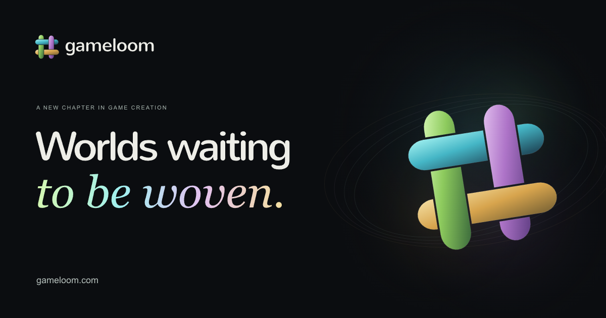


Make the first impression feel like Gameloom.
1200 × 630 px / opaque PNG / sRGB. The dashed guide shows a minimum 64 px inset on all four edges; it is not part of the export.
1080 × 1080 square
512 × 512 avatar
Use the square composition for square posts. Keep the avatar's core mark inside a circular crop.
Share the finished artwork.
The landscape card is the default website preview. Keep the wordmark, short headline and distinctive weave together. Use the dedicated square artwork instead of cropping the landscape card.
Keep essential content at least 64 px from landscape edges. Platforms can crop or overlay content differently, so inspect the actual preview after upload. A safe area reduces risk; it does not guarantee a particular platform's crop.
For web sharing
Serve the PNG at a public HTTPS URL with an image content type. Set Open Graph and large-image card metadata, dimensions and a useful image description. The preview image must be reachable without a login.
After an update, check the fetched image and page metadata. Social platforms may cache earlier previews. Use descriptive alternative text in posts that support it.